Quality
reporting design: how to build management dashboards that drive action
Quality reporting that drives management action has three characteristics that distinguish it from quality reporting that merely informs: it shows the gap between actual performance and the target (not just the absolute number), it highlights exceptions that require a decision (not just a trend that requires observation), and it connects each reported metric to a specific owner and a specific required action. The four elements of an action-forcing quality dashboard are: KPIs with targets and trend lines (so the direction of performance is visible, not just the current value), exception flags (automatic highlighting of any metric that has crossed a threshold requiring management response), owner assignment (each metric has a named owner who is accountable for the response when the metric triggers), and action tracking (the decisions and corrective actions from the last review are visible and their status is updated before the next review).
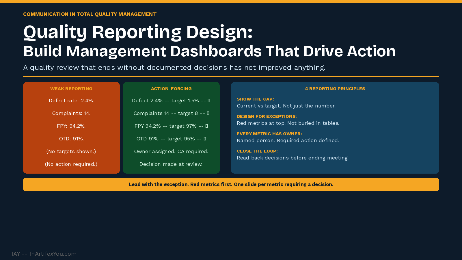
Quality reporting design determines whether quality data produces management action or simply occupies meeting time. The most common failure in quality reporting is presenting data without connecting it to decisions — producing reports that are reviewed, discussed, and filed without changing any behavior. The design principles below convert quality reporting from an information activity into a decision-making activity.
Principle 1: Show the Gap, Not Just the Number
|
WEAK REPORTING (INFORMING) Defect rate this month: 2.4%. |
STRONG REPORTING (ACTION-FORCING) Defect rate: 2.4% vs target 1.5% -- 0.9 pts above target. |
Principle 2: Design for Exceptions, Not Completeness
Management attention is limited. A quality dashboard that presents 20 metrics of equal visual weight ensures that attention is distributed randomly — not directed where it matters most. Design the dashboard to make exceptions impossible to miss:
- Red/yellow/green status indicators: each metric has a defined threshold. Above threshold = green (no action needed). Below threshold = yellow (monitor). Below floor = red (action required this week).
- Exception-first layout: metrics in red appear at the top of the dashboard — not buried in the middle of a table.
- Trend arrows: a metric at target but moving in the wrong direction deserves attention before it becomes a red metric.
Principle 3: Every Metric Has an Owner
|
Metric |
Owner |
Target |
Current |
Status |
Required Action if Red |
|
Defect Rate. |
QE Manager. |
Below 1.5% |
2.4% |
🔴 Red. |
Root cause analysis by Friday. Update at next review. |
|
Customer Complaints. |
Customer Service Mgr. |
Below 8/month. |
14. |
🔴 Red. |
Category analysis. Corrective action plan within 5 days. |
|
First-Pass Yield. |
Production Mgr. |
Above 97% |
94.2% |
🔴 Red. |
Process audit on top-defect station. Report findings. |
|
Supplier DPPM. |
Procurement Mgr. |
Below 500 |
320 |
🟢 Green. |
No action required. Monitor trend. |
Principle 4: Close the Loop at Every Review
A quality review meeting that ends without documented decisions produces no improvement — regardless of how well the dashboard is designed. Close the loop at every review:
- Review actions from last meeting: what was committed, what was done, and what is the result.
- Review current red metrics: who owns them, what is the corrective action, and what is the timeline.
- Assign new actions: specific owner, specific deliverable, specific date.
- Update the dashboard before the next review: if a metric improved because of an action, note the connection.
Back to hub:
- Visual management in TQM: how to communicate quality at the point of work.
- Management review communication: how to present quality data to leadership.
- ISO 9001 clause 7 communication: how to implement the requirements.
🔗 INTERNAL LINK SUGGESTIONS
| ||||||||||||||||||||||
The Continuous Improvement Certification at InArtifexYou gives you a complete, practical system to map, baseline, improve, and sustain any process — and the verified credential to prove you can lead it.
inartifexyou.com/continuous-improvement-certification-online.html | ||||||||||||||||||||||
|